Library Logo Breakdown: Naperville Public Library
- Log in to post comments
As a multiuse element of branding, logos may act as the first opportunity for patrons to connect with the library. Found on bookmarks, signage, websites, and other outreach materials, a well-designed logo is a tool to aid the public perception of the library. Recognizability and accessibility are integral to an effective logo, allowing patrons to easily decipher messaging.
In the age of the internet, logo design and branding are even more crucial:
So, what does an effective library logo look like? What considerations do libraries need to address when designing their logos?
In response to these questions—and because the topic of logo design is so fun to discuss! —we will be exploring our member libraries’ logos in the series: Library Logo Breakdown.
We’ve solicited responses from libraries about the story of their logos, and we will present the information they’ve shared in this series.
This week’s logo breakdown comes from Trente Arens, Director of Marketing and Communications at Naperville Public Library.
GG: What is the story of your logo?
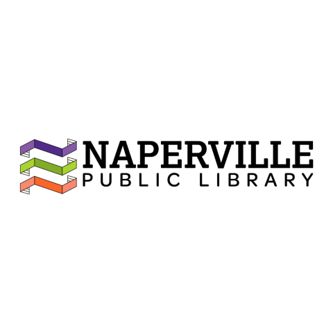
TA: The logo itself was inspired by 3D paper art and the idea that something seemingly simple, like the two-dimensional pages of a book, can become an engaging, three-dimensional masterpiece. Much like readers can interpret a story differently, the logo was designed with a lot of hidden meaning that may or may not be seen depending on each individual viewer’s unique perspectives.
The purple, green and orange banners are meant to look like Ns, representing not only Naperville but each of the three library locations – Nichols, Naper Blvd. and Ninety-Fifth Street.
Together, the banners wrap around an invisible column, reminiscent of a “staircase of knowledge” that curiosity-seekers can climb on their intellectual journey.
Each banner can also be manipulated to form the shape of a book, with the detail on the inside of the banners representing book pages.
GG: How was your logo designed?
TA: We partnered with an outside agency called Joy Riot for a full rebrand that included the logo.
GG: How long ago did you begin using your current logo?
TA: We debuted our new logo during National Library Week in April 2022.
GG: How do you feel your logo reflects your library?
TA: Like I shared in the story question above, I think this logo is a great representation of who we are as a library. I love the hidden meanings within the logo, including the subtle nod to all three of our locations with the three "Ns" and that it evokes the feeling of a book/book stacks without having an actual book in the logo. The bright color palette was also specifically chosen to convey the library's warm and inviting nature.
GG: How has your logo usage affected your branding and community engagement?
TA: We had the same logo for 20+ years, so changing to this new logo was an adjustment for some, but it breathed so much new life into our marketing and branding efforts. We used it as a catalyst to redesign in-building signage, launch a new community mailer, paint walls in our new colors, buy lots of giveaways in purple, green, and orange, etc. Naperville Public Library has a more recognizable presence in the community now, and I think our logo and corresponding rebranding efforts had a lot to do with that.
Special thanks to Trente Arens for her time and feedback.