Library Logo Breakdown: Addison Public Library
- Log in to post comments
As a multiuse element of branding, logos may act as the first opportunity for patrons to connect with the library. Found on bookmarks, signage, websites, and other outreach materials, a well-designed logo is a tool to aid the public perception of the library. Recognizability and accessibility are integral to an effective logo, allowing patrons to easily decipher messaging.
In the age of the internet, logo design and branding are even more crucial:
So, what does an effective library logo look like? What considerations do libraries need to address when designing their logos?
In response to these questions—and because the topic of logo design is so fun to discuss! —we will be exploring our member libraries’ logos in the series: Library Logo Breakdown.
We’ve solicited responses from libraries about the story of their logos, and we will present the information they’ve shared in this series.
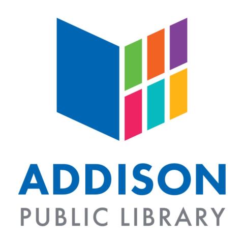
Addison Public Library’s logo was submitted by Communications & Marketing Coordinator, Samantha Parkison.
GG: What is the story of your logo?
SP: We had a logo that didn't match the modern aesthetic of our building. We wanted a bold, flexible design that could work in a variety of colors and formats, while also connecting visually to books and our physical space.
GG: How was your logo designed?
SP: A former staff member designed the logo. We were fortunate that this staff member at the time had graphic design skills and was able to create the logo in-house. Their familiarity with our library’s mission and style made it especially meaningful and well suited to our needs.
GG: How long ago did you begin using your current logo?
SP: Since early 2014, and the most current iteration of the logo (updated colors and font) in June 2019.
GG: How do you feel your logo reflects your library?
SP: Our logo reflects the welcoming and modern feel of our building while also nodding to the traditional symbol of a book. Its clean lines, adaptable color palette, and bold design highlight our commitment to being both a forward-thinking and community-centered library. The shape also resembles a window—symbolizing how libraries are a window to connection, creativity, lifelong learning, new worlds, and so much more.
GG: How has your logo usage affected your branding and community engagement?
SP: Having a cohesive, flexible logo has strengthened our visual identity across print, digital, and physical spaces—both in the library and around the community. It’s helped us create consistent messaging, boost recognition, and present ourselves as a modern, reliable, and inviting space and resource for Addison.
Thank you to Samantha Parkison for their time and assistance on this blog post.