Library Logo Breakdown: Lillie M Evans Library District
- Log in to post comments
As a multiuse element of branding, logos may act as the first opportunity for patrons to connect with the library. Found on bookmarks, signage, websites, and other outreach materials, a well-designed logo is a tool to aid the public perception of the library.
Recognizability and accessibility are integral to an effective logo, allowing patrons to easily decipher messaging.
In the age of the internet, logo design and branding are even more crucial:
So, what does an effective library logo look like? What considerations do libraries need to address when designing their logos?
In response to these questions—and because the topic of logo design is so fun to discuss! —We will be exploring our member libraries’ logos in the series: Library Logo Breakdown.
We’ve solicited responses from libraries about the story of their logos, and we will present the information they’ve shared in this series.
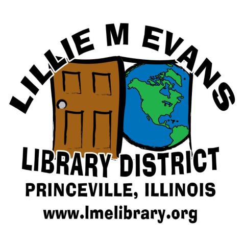
The Lillie M Evans Library District is our featured logo today. Kate Will, who specializes in Marketing and comes from Library Services in the district, submitted their logo design that she created 16 years ago. Kate has been at Lillie M Evans for 17 years as of August 2025. Congrats on your dedication to the library, Kate!
GG: What is the story of your logo?
KW: The director who hired me (Joanne Cox) knew I was proficient in Photoshop and had studied graphic design in college, so she asked me to come up with a logo for the library. She wanted something that represented the library being a doorway to outside our small, rural town. Bringing the world to our residents.
GG: How was your logo designed?
KW: I took that input and rough-sketched a few things, and after she picked a direction, I fleshed it out.
GG: How long ago did you begin using your current logo?
KW: We started using it as soon as she approved it in 2010.
GG: How do you feel your logo reflects your library?
KW: I’m a bit biased 😉 and like it.
GG: How has your logo usage affected your branding and community engagement?
KW: The past 5-ish years or so I began making a standard header/footer on our social media that included our logo and contact information, so there was no confusion who was hosting the programs.
Over the past year, I began working to color-code the header/footers based on the demographic the information was for and including a coordinating corner stating the age ranges when applicable.
Thank you to Kate Will for her time and assistance on this blog post.
Comments
What a charming logo! It…
What a charming logo! It clearly communicates your intention of opening the world to residents. I love the hand drawn, yet bold and vectorized, look of the lines. It feels professional and relatable. And, although I don't think it was intentional, the top of the door and doorway have nice subtle arcs that bring to mind an open book. I almost wish that was made more apparent, but again, I don't think it was done on purpose.
The typeface is a perfect match as well. It has the same boldness of the drawing, clear readability, and slight irregularities that make it feel more human and welcoming. The letter counters being rectangular (minus that capital A), work well with the repeated motif in the drawing.
I would have loved to see the initial rough sketches before you landed on this version. Maybe that's just because I also studied art and design. In any case, I liked reading this breakdown!