Library Logo Breakdown: Orland Park Public Library
- Log in to post comments
Logos may act as the first opportunity for patrons to connect with the library. Found on bookmarks, signage, websites, and other outreach materials, a well-designed logo is a tool to aid the public perception of the library.
So, what does an effective library logo look like? What considerations do libraries need to address when designing their logos?
In response to these questions—and because the topic of logo design is so fun to discuss! —we will be exploring our member libraries’ logos in the series: Library Logo Breakdown.
We’ve solicited responses from libraries about the story of their logos, and we will present the information they’ve shared in this series.
Our featured logo this week is from Orland Park Public Library. Their logo was submitted by Jackie Boyd, Communications Manager. Their Graphic Designer, Kristen Holding, also answered interview questions.
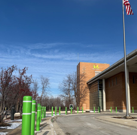
Orland Park Public Library’s logo has been in use for many years, but they've recently placed a large-scale copy on their building chimney. This large effort will increase the visibility of their library and is an exciting development for their continued recognizability within their community!
GG: What is the story of your logo?
JB & KH: The logo is meant to look like a book that is opening with the pages being green leaves and/or petals. This goes well with our motto: A Natural Connection. The "A Natural Connection" motto comes from our community. The name Orland Park came from the area's numerous green spaces and parks.
GG: How long ago did you begin using your current logo?
JB: Our logo is 17 years old. It was created in approximately February 2009 in Adobe Illustrator by Melissa Takalsky.
GG: How do you feel your logo reflects your library?
JB: To illustrate our connection to the Orland Grassland, the library commissioned a More than Grasslands Mural in June 2004, with the help of many small donations from community members, which later inspired us to think about the library's connection to nature when we were designing our logo. Our connection is also with the community we serve, so it has a double meaning. We have other "connection"-themed areas around the library, like the Community Connection Wall, where we share flyers from local nonprofits and schools. Our newsletter is called "The Connection", and our eblast is called "The eConnection".
GG: How has your logo usage affected your branding and community engagement?
JB: In 2016, during a project to replace the library's carpeting near the entrance of the building, with a Live and Learn Construction Grant, the library placed the library logo into the tile on the floor. In 2021, we animated our logo to open like a book to place as one of our branded introductions to library videos. Also, in 2021, we introduced The Backyard, the library's nature center, which was sponsored by the Aileen S. Andrew Foundation. It offers meaningful opportunities for patrons to deepen their connections with nature, spark creativity, and discover environmental awareness programming offered by the library. It is also a favorite place for little kids to run around, and it is where we host animals that visit the library, like the "Goats in Holiday Sweaters" that visit us early in December to help kick off our winter reading challenge.
Special thanks to Jackie Boyd and Kristen Holding for their time and assistance with this post.