Library Logo Breakdown: La Grange Park Public Library
- Log in to post comments

As a multiuse element of branding, logos may act as the first opportunity for patrons to connect with the library. Found on bookmarks, signage, websites, and other outreach materials, a well-designed logo is a tool to aid the public perception of the library.
Recognizability and accessibility are integral to an effective logo, allowing patrons to easily decipher messaging.
In the age of the internet, logo design and branding are even more crucial:
So, what does an effective library logo look like? What considerations do libraries need to address when designing their logos?
In response to these questions—and because the topic of logo design is so fun to discuss! —We will be exploring our member libraries’ logos in the series: Library Logo Breakdown.
We’ve solicited responses from libraries about the story of their logos, and we will present the information they’ve shared in this series.
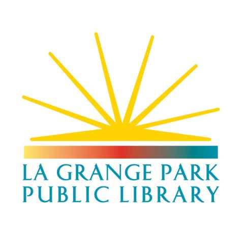
Our featured logo this week, from La Grange Park Public Library, was submitted by their Marketing Coordinator, Janet Tencza.
GG: What is the story of your logo?
JT: The logo for La Grange Park Library was inspired by the iconic building architecture as well as its core collection of books.
The yellow burst represents the pages of a book opening to all the library has to offer. The curve reflects the arched ceiling. The bottom color band represents the spine of a book that holds the pages together.
GG: How was your logo designed?
JT: Adobe Creative Cloud
GG: How long ago did you begin using your current logo?
JT: We believe the logo was designed by Andrea Barnish and the current version dates to early 2016. It replaced a similar one (attached), which was probably also designed by Andrea, possibly with the assistance of Tari Marshall.
GG: How do you feel your logo reflects your library?
JT: The reasons mentioned above speak to our library and its place in the community. It also uses bright colors and a simple design that makes our library recognizable in the community.
GG: How has your logo usage affected your branding and community engagement?
JT: The longevity (and the prior similar version) of our logo helps with brand awareness and community pride.
Thank you to Janet Tencza for their time and assistance with this blog post.
