Library Logo Breakdown: Joliet Public Library
- Log in to post comments
As a multiuse element of branding, logos may act as the first opportunity for patrons to connect with the library. Found on bookmarks, signage, websites, and other outreach materials, a well-designed logo is a tool to aid the public perception of the library. Recognizability and accessibility are integral to an effective logo, allowing patrons to easily decipher messaging.
In the age of the internet, logo design and branding are even more crucial:
So, what does an effective library logo look like? What considerations do libraries need to address when designing their logos?
In response to these questions—and because the topic of logo design is so fun to discuss! —we will be exploring our member libraries’ logos in the series: Library Logo Breakdown.
We’ve solicited responses from libraries about the story of their logos, and we will present the information they’ve shared in this series.
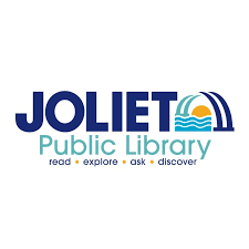
This week, we are taking a look at Joliet Public Library’s logo, submitted by their Communications Manager, Mallory Hewlett-Cantu.
GG: What is the story of your logo?
MHC: We wanted a vibrant, modern, clean logo that evokes history with a fresh spin. Joliet is famous for its drawbridges, so we wanted to display those in the logo...connecting the east and west sides of the city.
GG: How was your logo designed?
MHC: We worked with designer Hillary Rhodes. Our leadership team provided our ideas, vision, and guided the design.
GG: How long ago did you begin using your current logo?
MHC: About 2 years
GG: How do you feel your logo reflects your library?
MHC: The Joliet Public Library logo serves as a visual narrative of our commitment to education, community, and history. The bridges represent the physical and symbolic connections that unite our city. The sun setting over the water evokes enlightenment and the pursuit of knowledge. Our tagline Read • Explore • Ask • Discover reflects our mission to inspire learning and curiosity in patrons of all ages. The bold, prominent JOLIET emphasizes that we are one strong, united community. Our logo subtly tells the story of who we are.
GG: How has your logo usage affected your branding and community engagement?
MHC: Our logo has played a significant role in strengthening both our branding and community engagement. Visually, it creates an immediate and recognizable identity that reflects Joliet’s unique character; bridges, waterways, and unity. The symbolism of knowledge and connection resonates deeply with our mission and values, helping us present a consistent message across digital, print, and in-person platforms.
Thank you to Mallory Hewlett-Cantu for their time and assistance with this post.