Library Logo Breakdown: Cook Memorial Public Library District
- Log in to post comments
Logos may act as the first opportunity for patrons to connect with the library. Found on bookmarks, signage, websites, and other outreach materials, a well-designed logo is a tool to aid the public perception of the library.
So, what does an effective library logo look like? What considerations do libraries need to address when designing their logos?
In response to these questions—and because the topic of logo design is so fun to discuss! —we will be exploring our member libraries’ logos in the series: Library Logo Breakdown.
We’ve solicited responses from libraries about the story of their logos, and we will present the information they’ve shared in this series.
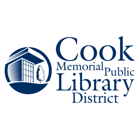
Our featured logo this week is from the Cook Memorial Public Library District. Submitted by Bronwyn Gardner, the logo was designed by their graphic designer, Andrew Traynor.
GG: What is the story of your logo?
BG: We wanted a new logo to usher our library district into a new era after the completion of our second full-service location in 2010. While each building was in a different town in our district and each had a distinctive style. One unifying feature was the style and size of the entrances. This motif was the basis of our unifying logo design.
GG: How long ago did you begin using your current logo?
BG: 2010. We have often wondered if it's time to update the logo, but each time we find the design to be pretty timeless and very representative of our library district.
GG: How do you feel your logo reflects your library?
BG: The navy-blue color in color psychology represents trustworthiness, stability, and reliability — three values we hope our community thinks of when they think of the library. Our logo emblem is very representative of the design of our buildings — it's recognizable.
GG: How has your logo usage affected your branding and community engagement?
BG: As I mentioned in the previous answer, since the logo uses the design motif of the entrances to our buildings, the logo is recognized as our library district immediately.
In addition to their logo design, Cook Memorial PL also created a style guide document to ensure their logo and branding is consistent across platforms. Their guide features different logo layouts and guidance on what to avoid with logo usage; some of which are that their logo be over 1 inch large and consistent in font style and font color.
A style guide can be helpful as a means of answering frequently asked questions about the use of your logo. Such as: How will your logo differ when printed on a t-shirt versus when it's featured on your website? What common pitfalls might users of your logo (library employees and/or trustees) encounter?
Special thanks to Bronwyn Gardner for her time and assistance with this post.